
This week on Wearables Wednesday I’m doing a review of the second iteration of a tracking device that works with an iOS (and Android) app to help you find lost items. Back in the TUAW days, I reviewed the first version of TrackR; now TrackR bravo is available for pre-order (US$29.99). I had an opportunity to test a pre-release version of TrackR bravo, and I still have some reservations about this entire class of “wearable”… Read on for details.
Specifications
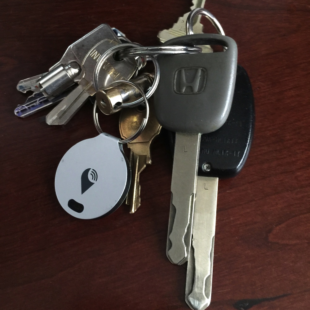
- Diameter: 31mm
- Thickness: 3.5mm
- Battery Life: 1 year
- Battery Type: Replaceable CR1616 Battery
- Device Ringer Volume: 85dB
- Connectivity: Bluetooth 4.0 (Bluetooth Low Energy)
- Device Compatibility: iPhone 4s & Later, iPad 3rd Generation & Later
Design
The idea behind TrackR bravo and similar Bluetooth trackers is that you connect them to something you don’t want to lose — a jacket, keys, a purse, a laptop case, a wallet, etc… — and pair the tracking device with an iPhone app. Lose the item, and you can fire up the app to “ping” the tracker, which will respond by making a sound.
If that doesn’t work, the app displays a map showing the last known location of the tracker and whether you’re within about 100 feet of it or not. You can also use a tiny button on the TrackR bravo to ping your iPhone if you’ve misplaced it; this is extremely useful if you have the volume turned up on your phone as it works even when you have the ringer muted.
TrackR had the idea of what they call Crowd GPS. The idea is that if enough people own TrackRs and have the TrackR app on their iPhones, then anytime someone else walks past a tagged item, the app can pass along the location of that tag to its owner.
The TrackR bravo is certainly thin, and at 3.5mm it could easily fit into a wallet. TrackR even sells a tiny waterproof attachment that will let you clip the TrackR onto a pet collar, and another that keeps the TrackR bravo waterproof for humans who engage in water sports.
Functionality
TrackR bravo works quite well within the confines of a home or office. However, there are some limitations you should be aware of.
First, the beeper on the device allegedly emits an extremely rising tone at 85db. I could barely hear the beeper even when it was right near me, so I used an app (dB Meter Pro) to check the level. It maxed out at about 69dB, which is considered to be about the level of “normal street noise, an average radio, or conversation between 3 – 5 feet”. Chances are pretty good that you’re not going to be able to hear the beeper if it’s stuck under a pillow on a couch…
Next, realize that the 100-foot range is a maximum theoretical distance. I found that in some cases, I could be as close as 20 feet and still not have a connection due to interfering light fixtures, wiring, and ductwork. There’s also no directional capability, meaning that when you do get a connection to the TrackR bravo from the app, you don’t know in what direction to walk to get to the TrackR. You’ll still have to wander around, pinging the TrackR and hoping you’ll be able to hear it.
Finally, while the idea of Crowd GPS is attractive, the reality is a little less glowing. The TrackR website shows a “heat map” of the United States displaying everywhere that your device is likely to be tracked by other TrackR users. However, even though the map at the national level showed that most of the Colorado Front Range and mountain areas were “in the zone”, zooming in on a city level shows just how few TrackR users are around. Chances are slim that someone with the TrackR app just might happen to wander by your lost keys or jacket.

Ahead of the Apple Watch debut later this month, Wired’s David Pierce interviewed Apple’s Kevin Lynch, who left Adobe in 2013 and joined the Cupertino company. The long-form article doesn’t focus on Lynch exclusively; rather it chronices the history and development of the Apple Watch.
In his conversation, Lynch reveals that Apple developed the Watch to solve a problem it created with the iPhone — too much time interacting with a phone and not enough undistracted time with other people.
“We’re so connected, kind of ever-presently, with technology now,” Lynch says. “People are carrying their phones with them and looking at the screen so much.” They’ve glared down their noses at those who bury themselves in their phones at the dinner table and then absentmindedly thrust hands into their own pockets at every ding or buzz. “People want that level of engagement,” Lynch says. “But how do we provide it in a way that’s a little more human, a little more in the moment when you’re with somebody?”
There were a lot of individuals involved in the development of the Watch — high-profiles leads such as Lynch and countless team members not mentioned in the Wired article. Besides Lynch, other project leads include Alan Day, head of Apple’s human interface group, and lead designer Jony Ive, whose obsession with Horology reportedly was one of the driving forces behind the Watch project.
As revealed by Lynch, the first Apple Watch prototype, ironically, was an iPhone rigged with a velcro strap to attach to a wrist. The team then built a life-sized Watch simulator for the iPhone that would allow them to test the software features without the actual watch hardware.
With a crude, but working prototype in hand, the team went to work on developing an interface that provided for meaningful, but minimal interaction. The Watch team discovered early on that some interactions took too long to accomplish on a device strapped to your wrist. As a result, the Watch design team was forced to refine and sometimes eliminate any cumbersome tasks.
As the testing went on, it became evident that the key to making the Watch work was speed. An interaction could last only five seconds, 10 at most. They simplified some features and took others out entirely because they just couldn’t be done quickly enough. Lynch and team had to reengineer the Watch’s software twice before it was sufficiently fast.
Apple initially envisioned a chronological workflow, similar to the upcoming Pebble Watch, but abandoned the idea. The team instead focused on “streamlining the time it takes a user to figure out whether something is worth paying attention to.” It took three rounds of refinement until the team nailed the launch version of the software.

The software then had to work with the hardware team to develop a Watch that would work well and wear comfortably on the wrist. The teams collaborated on the development of Watch’s Taptic engine, which required them to turn notifications into physical sensations.
Apple tested many prototypes, each with a slightly different feel. “Some were too annoying,” Lynch says. “Some were too subtle; some felt like a bug on your wrist.” When they had the engine dialed in, they started experimenting with a Watch-specific synesthesia, translating specific digital experiences into taps and sounds. What does a tweet feel like? What about an important text?
It took more than a year for their work to reach a point that satisfied the hard-to-please Jony Ive. The hardware and software teams also had to develop novel ways of interacting with a small screen such as the digital crown, Force Touch and Watch specific font type San Francisco.
They also designed an entirely new typeface, called San Francisco, which is more readable on a small display than Apple’s standard Helvetica. The letters are more square, Dye says, “but with gentle, curved corners,” mimicking the Watch’s case. It’s wide and legible at small sizes, but when it gets larger the letters tighten up a little more. “We just find it more beautiful,” he adds.
If you have some free time, the entire Wired article is worth a read. There’s a ton of insight into the time and effort that went into developing the Watch.


