A future version of Apple’s Maps app could not only give directions, but help you plan a trip. Apple has filed for a patent (number 20200202600) for a “map application with novel search, browsing and planning tools.”
The tech giant says that, with the proliferation of mobile devices (such as smartphones), numerous mobile-device apps have been developed to assist users with many of their daily activities. Map and navigation applications are one type of such applications. Apple says that, however, many of the applications today do not have optimal controls for one handed operations by their users, especially when it comes to smartphones with larger screens.

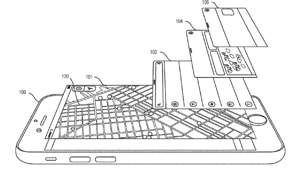
Apple’s idea for Maps on the iPhone is that, in addition to panning and zooming operations, optional display areas would slide offer an onscreen map. These areas could offer information about selected locations (the closest coffee shops, arrival time from your current location, etc.), identifying routes to these locations, providing navigation presentations for these locations, and more.
Here’s the summary of the invention: “Some embodiments of the invention provide a map application with novel map exploration tools. In some embodiments, the map application executes on a mobile device (e.g., a handheld smartphone, a tablet, etc.) with a touch sensitive screen. The map application of some embodiments has a first display area to display a map of a region, and second and third display areas to display information about items displayed on the map in the first display area.
“In some embodiments, the second display area slides over the first display area to overlap at least a portion of the first display area. After the second display area slides over the first display area, the third display area in some embodiments slides over the first display area to overlap at least a portion of the first display area. In some embodiments, the second and third display areas slide over the first display area from one side of the first display area. This side is the bottom of the first display area in some embodiments.
“In some embodiments, the bottom side is expected to be closer to a position for resting the mobile device in a hand of a user than a top side of the first display area. Accordingly, in some embodiments, the second and third display areas slide up from the bottom side of the first display area so that information and/or controls that are provided in these display areas are more accessible for one handed operations (e.g., thumb-based touch operations) of the user as the user hold and interacts with the device with one hand.”
