I always have a soft spot in my reviewer’s heart for “one trick ponies.” Sometimes all I need from an app is one, single function. And for it to do it very well and simply, so that I can move on with my work.
But now OTPs are crowding the market. Plus, some bigger apps have rolled several (or many) OTPs into their apps (a corral of OTPs?). This can make for a bloated desktop and Menu Bar.
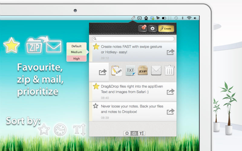
That brings us to Ideally for Mac OS X, which offers a fast way to make notes and keep notes’ related files in one place.
The app is easy to use. Hotkeys, swipe gestures, animations, ‘Drag&Drop’ help you navigate between views that look like a notepad. Everything’s right at your fingertips in your menu bar.
Ideally also allows you to zip, email, preview files right inside the app, which is great, as there’s no need to bounce between desktop or file system.”
The app is designed, for want of a better analogy, to be a notes app with “roid rage.” Ideally has two window modes. Via settings, you can place the window either permanently above all other windows or set it to be brought to the forefront when summonsed. Either way, this setting can be operated by a “pin” button in the top right part or the window.
The window can also be detached from the menu bar and moved anywhere on your desktop. To keep your notes and files backed up, Ideally uses Dropbox sync which is activated in the Preferences window. Restoring and backing up is a one click action as soon as you link Ideally with your Dropbox account.
Ideally has file support, but the developer suggests that you not store big files in Dropbox (i.e., music or video files which exceed 200 MB), as the app wasn’t designed primarily for that. Another reason is that larger file sizes will increase your BackUp /Restore process time (depending on your Internet connection – your mileage may vary).
But if you plan to store some docs, images, PDF, screenshots, webpages, text files, Ideally will easily fill the bill.

The app is quite fast and pleasurable to use. Access to the settings and the window layer toggle switch is easy one click at the top of the window. Very refreshing to see something that is layer out this intuitively.
I dictated a couple of notes using OS X’s dictation function and all went well. It was so easy that I wonder if you may end-up having to perform note management on a regular basis.
If you press the settings button, you’re presented with a simple window from where you can toggle the window’s layer (but as I said, you can do this directly from the top of the note itself), a button to link to your Dropbox account and the simplest tutorial that you will ever likely to come across (a .pdf graphically depicting the swipes, hotkeys, et al., to making Ideally fly).
However, I did run into a few problems. First, I tried linking my Dropbox account. It claimed success linking Ideally to my cloud storage. But after an hour, whether I used my laptop or iPhone 4S, I still couldn’t locate any Ideally folder. And there’s nothing in the settings window to allow me to get under the hood and troubleshoot.
Second, there is no font selection. Confusing.
I look forward to seeing continue to be polished. At some point, I could easily see this layered on top on of one of my monitors 24/7.
Ideally costs $1.99 and requires Mac OS X 10.7 or higher. It’s available at the Mac App Store.

