iPadOS 14 was announced during the WWDC 2020 keynote today, and while there weren’t a huge number of new features added to Apple’s tablet operating system, the changes add significantly to the usability of the iPad as a computing platform. Let’s take a look at some of the changes that will come to many iPads this fall.
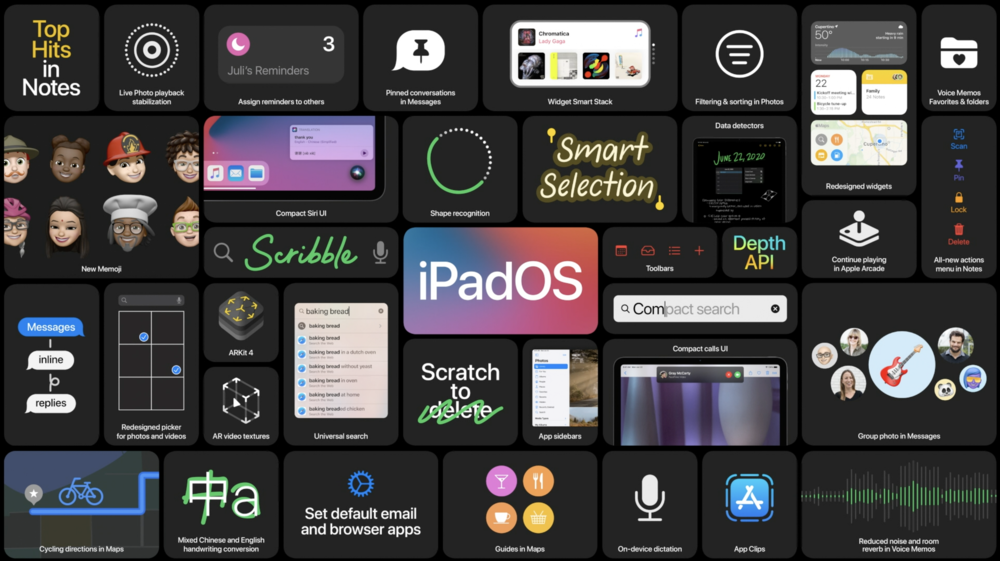
If you had a chance to read our coverage of the changes in iOS 14, then you’ll see that a lot of those features made it to iPadOS 14 as well. For example, the redesigned widgets that can be placde on the Home Screen in various sizes are coming over to the iPad as well. Once change that seems to be similar between iPadOS 14 and macOS Big Sur, is the addition of translucent sidebars in apps (hmmm, makes you wonder if the iPad and Mac may finally merge down the road….). In particular, the Photos app not only looks a lot more like the macOS Photos app, but also has a sidebar that makes it easier to both browse and organize photos. The Music app also gains a Mac-like sidebar in iPadOS.
One change I was happy to see is that when FaceTime or phone calls come in on the iPad, they no longer take over the entire screen. Instead, a small notification shows up on the screen that can be tapped to answer the call or flicked away to dismiss. Siri no longer takes over the screen when you need info — instead, Siri takes up a small window and results show up in the lower right corner of the display.
Another interesting design iteration that calls on macOS is the addition of drop-down menus on the iPad. Rather than have a group of icons, each with a separate function, it appears that some built-in apps gain a drop down menu with a list of items.

Like iOS 14, iPadOS has a Universal Search function and it’s much easier to see all apps in a scrolling list. Searches can be originated either from the Home Screen or in any app. Type a few characters, and apps, documents, and contacts appear quickly. Type a few letters in the Universal Search bar, and Safari opens a website.
Handwriting gains new importance in iPadOS 14, with a new “Scribble” function. Within notes, it’s now possible for rough shapes to be automatically converted to more precise shapes — this, oddly enough, was a feature of the Apple Newton MessagePad between 1993 and 1998. Another Newton feature makes it to the Apple Pencil and iPadOS 14 — “scratch” to delete text.
For those who like to take notes with Apple Pencil (not me!), any words, letters, or other items can be selected as if they were typed text. Let’s say that you hand wrote a poem with its title at the top of the page. With gestures, you will be able to select the title and change the text color. Handwritten notes can also be copied as text, then pasted into any normal text field.
Apple Pencil support also extends to any text field, so search criteria can be written into those fields. Oddly enough, handwriting recognition can now understand two different languages and character types in one sentence. For example, you could begin a sentence in handwritten English and end it in handwritten Chinese, and the operating system recognizes both.

App Clips are a thing in iPadOS 14, although I don’t think they’ll be as useful on the iPad as they will be on the iPhone. Being able to set third-party apps as defaults is going to be a big thing on the iPad — I think a lot of iPad users would rather set up another Mail app, for example, than use Apple’s Mail. If someone prefers Mozilla Firefox or Google Chrome on iPad, they’ll be able to set up that browser as a default.
One rather unsung app — Voice Memos — also gets a new lease on life in iPadOS 14. The app itself makes recordings sound better by reducing noise and room echoes, while the app gains favorites and folders for better organization of recordings.
Across the board, Apple is making a concerted effort to make toolbar icons similar in all operating systems. This is something that’s been needed for at least a decade; it’s great to see that the company finally paid attention to the little details.
