
Now that design guru Jony Ive is leaving Apple (though he’ll still be working with the company), I wonder if skeuomorphic design will return to the interfaces of Apple’s various operating systems.
First an explanation: skeuomorphism is the design concept of making items represented onscreen resemble their real-world counterparts. For example, Apple’s Maps app has an icon that looks like a map. The macOS Trash utility has an icon that looks like a trash can (or recycle bin, if you will).
Apple still users skeuomorphic design, but not as extensively as it once did. Once Ive took over the user interface design from Scott Forstall in 2012, it was obvious that he wasn’t a big fan of skeuomorphism.
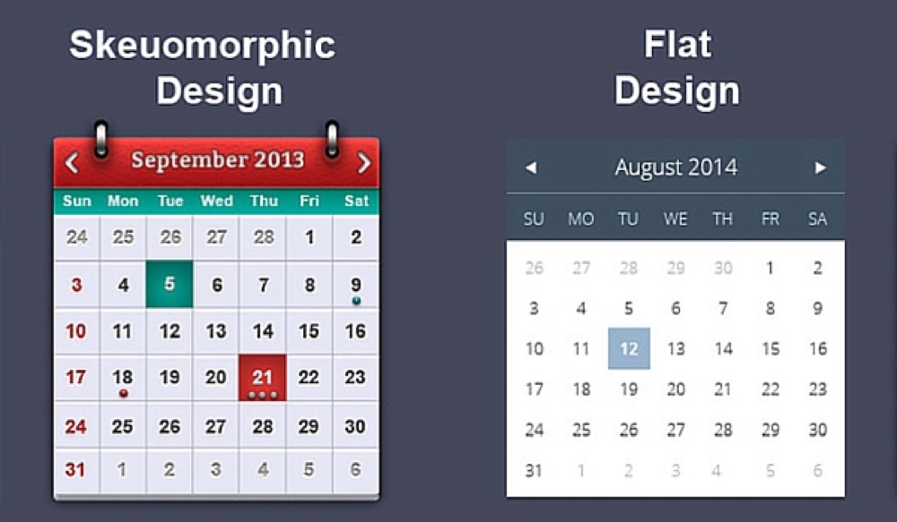
Forstall hated the term “skeuomorphism” but pushed hard for “photo illustrative, metaphorical” designs in user interfaces. For example, under his reign, the Calendar app looked like a paper desk calendar complete with faux coiled wire hinge. Notes resembled the appearance of yellow Post-It notes. Ive preferred a minimalist, flat design with clean edges, no shadows, and a lack of textures.
Personally, I kinda miss some of the skeuomorphic designs from the past. Sure, sometimes they went overboard — the green felt casino-y look of Game Center was particularly ugly — but when used tactfully and tastefully, skeuomorphic design can give users a quick sense of what an app does. That can be especially helpful for non-techie folks adapting to new devices.
I’m not betting big money that skeuomorphic design makes a comeback at Apple. However, I wouldn’t bet against it happening either.