Popular To-Do List app Any.do was updated today to version 3.0 which features an improved user interface, list sharing, theme support and more. The changes were applied across all platforms including iOS, Mac, web, Chrome and Android.
The first change you will notice with Any.do is a new guided tour that launches the first time you use the app. The four-step tour greets you with a Welcome screen and introduces you to Any.do’s list organization, the three new views (Date, Priority or original List), and group sharing. Once you view the guide or press the “skip” button, you hop right into the app and can begin organizing your to do list.

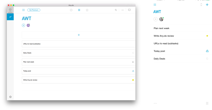
Any.do 3.0 has a revised usere interface that is standardized across all platforms, which makes it easy to use as it is the same no matter which device your are using. One UI for all devices has its drawbacks, especially on the desktop. It is clear that Any.do is focused on mobile, with a layout that looks great on the iPhone and iPad. When viewed on the desktop as shown above, this mobile-centric user interface has a lot of extra space.
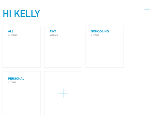
Any.do maintains the familiar experience of grouping your lists into defined folders such as personal, work and more. You can arrange the folders on the main screen by dragging and dropping them into the desired location. You now also can select any list to be your default list, a feature that was added in the latest version of the app. Because of the background syncing, these changes are propagated across all supported platforms automatically.

From the main folder view, you can easily view the tasks inside a folder by tapping on it. The default view shows your tasks according to date, but you can change that and select one of three views including date, priority status and original list. These new date and priority views are useful as they bring your most important tasks to the forefront.
Like most good task managers, Any.do supports recurring tasks, reminder alarms, priority status (star), notes, subtasks, and attachments. It also allows you to share a task and assign it to another any.do user. Mulitple users can share the task and add comments as needed.

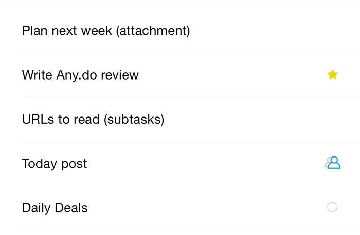
When viewing your to do list, each task is listed along with an icon to indicate whether the item was shared, starred, is recurring or has an alarm. Only one icon is shown per task and not all task features are shown. For example, there are no icons to indicate whether a task has a note or a subtask.
This handling of notes, attachments and subtasks has not changed and is a major detractor to the appp as you have to tap on the task multiple times to see if these items are included with the task. If you have only a few tasks each day, you may remember which ones have subtasks or notes. If you are working with an overload of tasks, it is quite cumbersome to tap on each one to see if there are any important notes or subtasks included.

The latest version of Any.do keeps its popular Moments feature on iOS, which allows you to drill down your task list one item at a time. When using moments, you can mark a task as completed or easily reschedule it for another day. You are allotted five moments per month on a free standard account and unlimited moments with a premium account.
Any.do 3.0 is available now on iOS, OS X and the web. It is free to use on any platforms, though advanced features require a subscription. As part of the version 3.0 launch, Any.do is discounting its premium subscription, lowering the price to $2.99 per month or $26.99 per year.
