For developers, just updating one app or publishing a new one can be a major undertaking. So imagine what the team at The Soulmen went through recently when they updated both their Ulysses for Mac Version 2.0 text editing app and created a new companion iPad app. After a long beta period for both apps, they’re now available and I’m happy to say that they’re both fantastic.
First, let’s look at Ulysses for Mac 2.0 (US$44.99), which has the distinction of being one of current Editors’ Choice picks on the Mac App Store. I’ve used Ulysses on and off for years to write blog posts offline, and the latest iteration definitely shows that the developers have thought about the writing process.
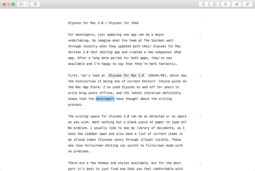
The writing space for Ulysses 2.0 can be as detailed or as spare as you wish. Want nothing but a blank piece of paper to type on? No problem (see image below). I usually like to see my library of documents, so I have the sidebar open and also have a list of current items in my iCloud inbox (Ulysses syncs through iCloud) visible. Those who love fullscreen editing can switch to fullscreen mode with no problems.

There are a few themes and styles available, but for the most part it’s best to just find one that you feel comfortable with and use it. Those themes are visible in the editor, while the styles are applied to documents once you’ve exported them.

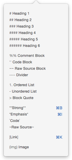
While you’re typing away, all of the standard tools you use for applying Markdown are available through keyboard shortcuts, the menu bar, a dropdown menu on the editor toolbar and through a right-click dropdown menu. As you apply certain markup tags to your document, they’re highlighted on the screen thanks to the themes.
I like to keep an eye on the Statistics “meter” in the toolbar in the upper right side of the editor. By clicking on the meter button, I have an immediate count of characters (with and without spaces), words, sentences, paragraphs, and pages. It even tells me how long the document will take to read, something that’s useful when I put together my scripts for the AWT News Update Podcast.
Since I usually create my new documents to be in my iCloud inbox, they’re saved automatically as I write. There’s no need to remember to save it; I can just shut down the app if needed and I know that the document is safe and sound.
When it’s time to see what your final document will look like, you just click the share sheet icon in the toolbar, select the type of document you’re creating (text, HTML, ePub, PDF or RTF), and click a preview button to open a window with all the styles applied. There are also buttons to copy highlighted text to the clipboard, save the text, open the text in another app, or send it via Messages, AirDrop or Mail.
If you’ve applied some outline structure or bookmarks to your document, it’s possible to navigate through the document easily using a navigation button in the toolbar.

Ulysses 2.0 also provides attachments for your document in the form of goals (image at right — how many characters or words you may want to write during a session, perfect for NaNoWriMo), keywords, notes, and images.
My favorite feature of Ulysses 2.0 is when I’m using it for blogging… and I hate to tell those developers who have had me review other blogging tools, but I’m back to Ulysses for good. I can easily copy my document to one of many formats by highlighting it, then using a menu item to copy as HTML, Markdown, plaintext, RTF (TextEdit) or RTF (Word). That’s extremely useful, as I use a Markdown block in our content management system and just paste the Markdown from Ulysses 2.0 straight into it. For our front page “nugget” of information, I just highlight the first paragraph or so of the document, then copy it as HTML and paste it into the proper spot in our CMS. That flexibility saves me a lot of time.
Next, the new Ulysses for iPad app ($19.99) is a well-designed and thought-out companion to the Mac app. I like to do some writing on my iPad with a keyboard just to get away from the Mac for a while, and the iPad app is perfect for that.
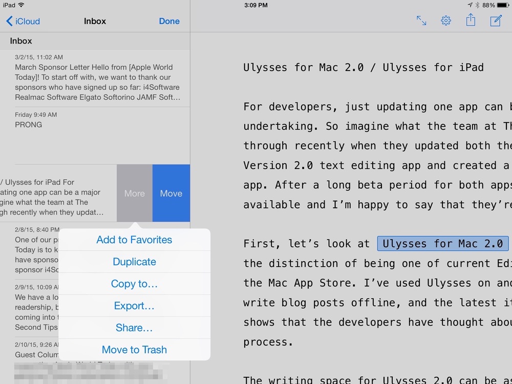
The app manages to squeeze the same two or three-pane design into an iPad screen (in landscape orientation, of course) very well, but it’s easy to get just the editor to dominate the screen by tapping on it. In the image below, I have the library open to my shared iCloud documents. You can see that a number of actions are available with a swipe on a document.

Since the iPad doesn’t have the same menu structure as the Mac, all of the commands are placed in a small toolbar at the top of the display and another at the bottom of the screen. The bottom bar appears when text is highlighted, providing one tap access to statistics and Markdown (or other style) commands. There’s a search button for finding and replacing text in the document, as well as almost the same attachments capability that is found in the Mac version — the goals attachment is missing.
When the top toolbar is needed, there’s a simple button to tap in the upper right corner of the window that brings it back into view.
After completing a document on the iPad version of Ulysses, it’s simple to share it, save it to a number of cloud services including Google Drive and Dropbox, or open it in apps that are either on your iPad or on your Mac.

It’s nice to see just how The Soulmen were able to design these two apps to work similarly on completely different platforms, while working within the constraints of screen size and touch interface on the iPad. Both apps are incredibly stable, a testament to the amount of beta testing the team did.
If you need or want to write on both the Mac and the iPad using Markdown, there’s really no better solution on the market right now than Ulysses 2.0 for Mac and Ulysses for iPad. The two apps are a powerful team, and although rather pricy, they’re well worth the price for anyone who writes for a living.
Highly recommended.
